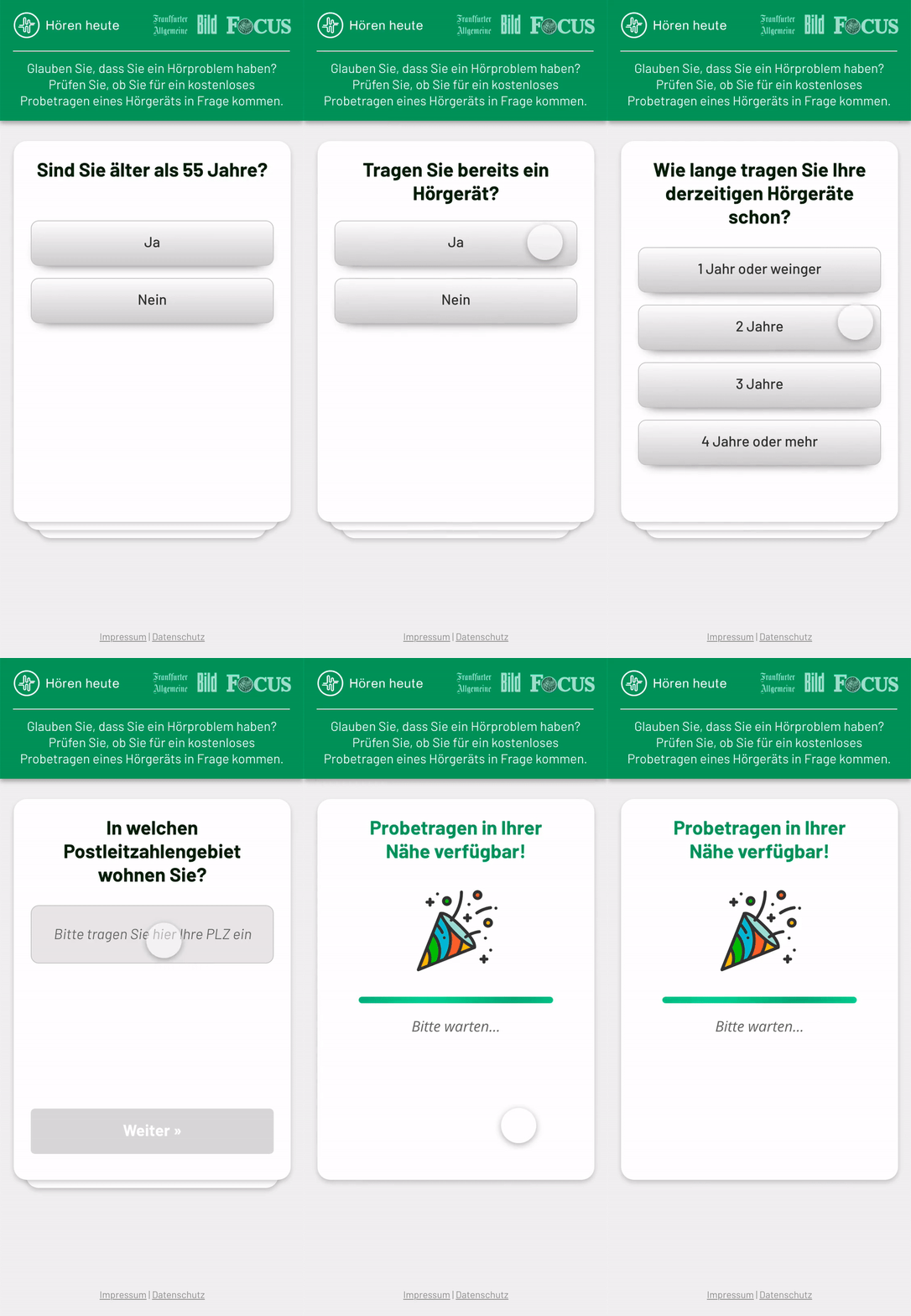
In the Customer Acquisition team at Audibene it was the job of the CRO team, Front-end team, and mine to have ready a seamless experience for our leads, easing their registration process and efficiently informing them before having our consultants approach them.
We worked in an Agile environment, running A/B tests on each part of the journey (landing pages, questionnaires, and success pages), identifying and addressing specific pain points, to then ideate solutions to these pain points and improve the experience of our customers.
An additional challenge was to push audibene branding initiatives within the lead generation process, marrying performance with brand building, but also juggle sub-brands the company uses.
Bellow: example of a common user flow between landing page, questionnaire, and success page. In this example we wanted the questionnaire to lightly indicate there are several steps to register, without giving a hard (possibly demotivating) number.


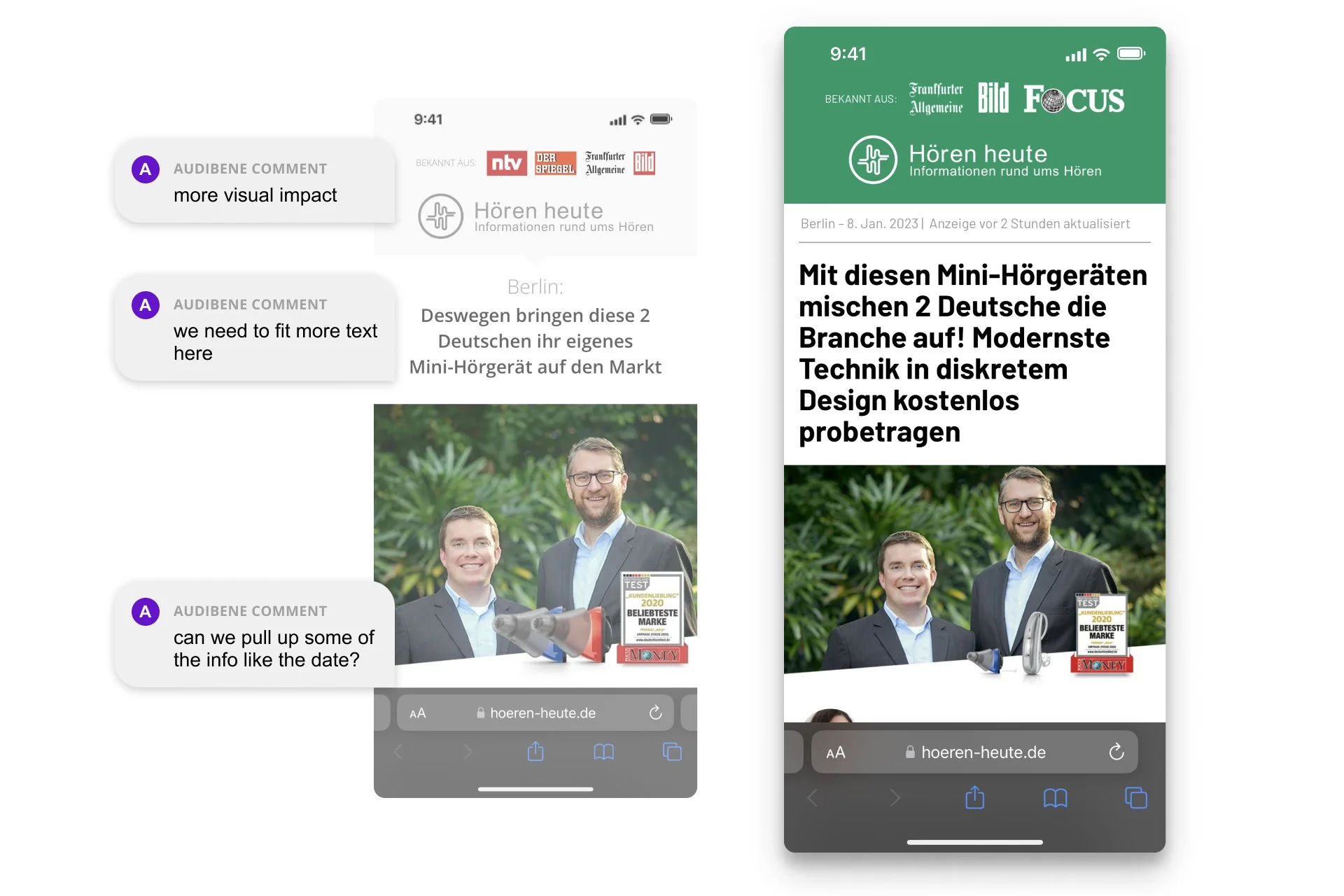
From left to right: old version of one of our most successful landing pages overlaid with the redesign goals. Next to it the redesign version which became the next best performer.
Continued improvement
We worked in an Agile environment which meant we were iterating through different design and technical solutions in a bi-weekly manner. One of the most successful iterations (seen above) marked a paradigm change in our landing pages and similar pages design for several of audibene's sub-brands.
The original problem we needed to address was how to fit more text into the page, without making our pages an eternal scroll experience with an impenetrable text wall.
I proposed three simple, yet fundamental changes that made our lading page cross and maintaing a conversion rate uplift above 10% and turn it into the new best performer:
Narrower fonts. More characters per row allowed copywriters to write longer or more meaningful titles.
A new stronger color palette helped us bring the attention of the users to either our trust elements or interactive elements.
Reuse images. I used the ratio of one of our most common ad sizes for our pages hero image, and other ad sizes for contextual images. Designers saved time producing assets and it enabled us to foster visually coherent journeys.
Above: extract from one of the four different component libraries I introduced to the team. Two libraries focused on Tokens and Atoms, while the other two focused on common elements for the web and email.
Branding and performance
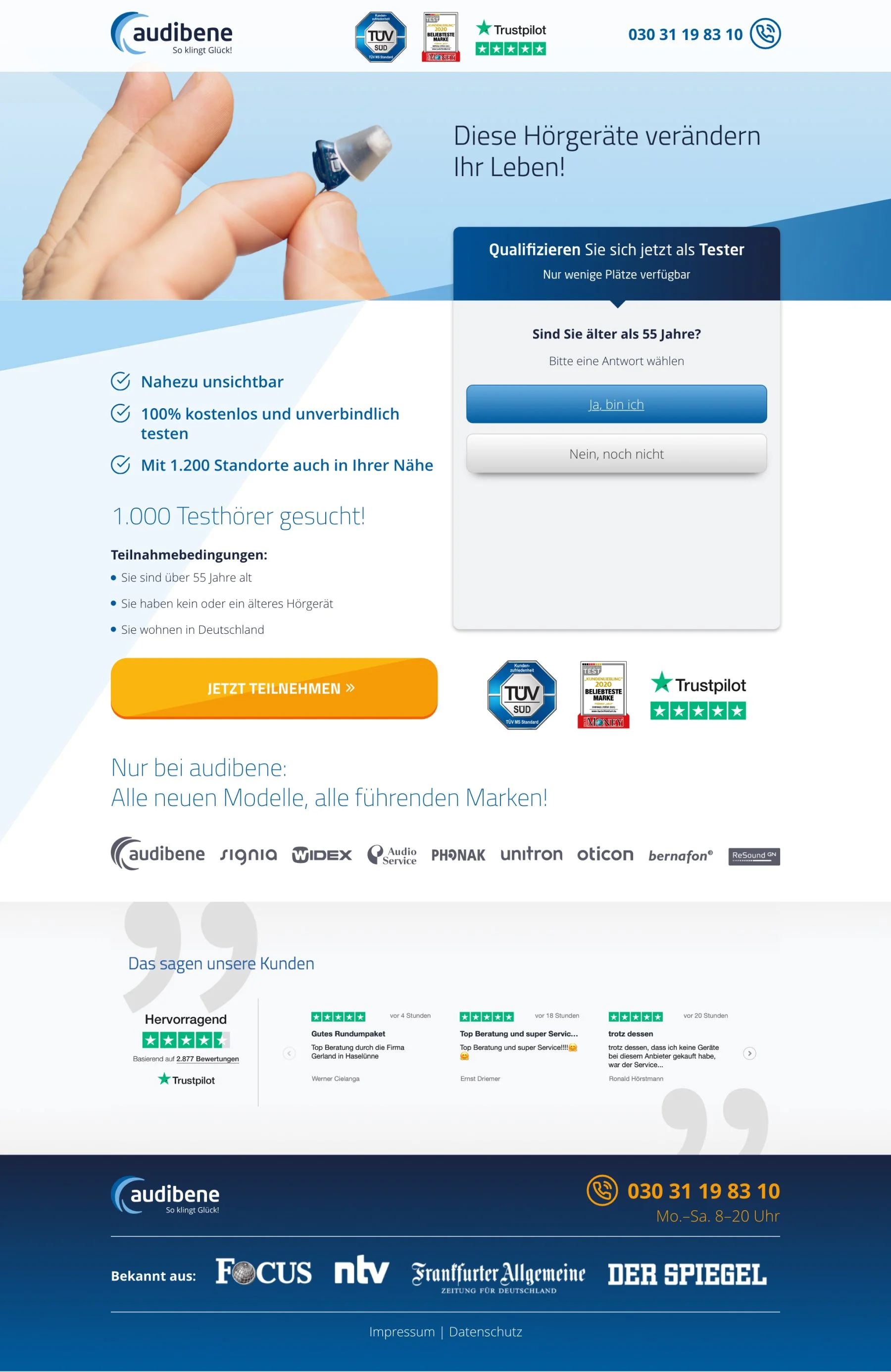
Audibene had been putting efforts in a brand redesign since 2020. Part of my work was also translating our pages into the new audibene design language whilst keeping our performance either intact or preferably improve it.
For these set of redesigns I held unto the existing structure of the page as a wireframe, and seeked to improve it following the learnings acquired.
Our tests showed users trusted our websites with large trust logos, large product and lifestyle imagery, high contrast and easier to click/tap buttons, and readable reviews.
From left to right: old version of one of our most successful landing pages overlaid with the redesign goals. Next to it the redesign version which became the next best performer.


